Case Study about Online Returns
All proprietary information has been removed. You can view the final prototype to see how it all came together. Read below to understand the process and strategy it took to get there.
Project Brief
Pitney Bowes Inc offers postage meters, customer information management, location intelligence, and customer engagement products. The company operates in three segments: Small & Medium Business Solutions; Enterprise Business Solutions; and Digital Commerce Solutions.
As part of its postage meter business, the company sells meter-related supplies. Clients sometimes need to return damaged or unwanted items. The stakeholders wanted to address the way this process flowed and make improvements where possible.Today’s Solution
Currently, if a client wants to return a product, they must call customer service. During peak hours, customers may wait up to 30 minutes, which has led to negative VOC and NSAT about supplies – in turn, having a negative impact on NPS.
Also, the entire process is manually done by Pitney Bowes agents: from creating the customer’s ticket, entering the product into the backend system (SAP), emailing the RMA to the client, and after receiving the package at the warehouse, entering the returned item into the system. All this is done by hand and is very time consuming.
Project Statement
For these reasons, I was tasked with creating a strategy to automate the returns process and bringing it online. A high value of savings to the business (actual number withheld) was projected if this feature was implemented.
I set milestones and at each one I would review my learnings with my Director of UX. With his feedback, I would proceed forward or adjust the concept.Stakeholder Input
The first step was to meet with the stakeholders to understand their goals and KPIs for the projects. The stakeholders included the Director of Ecommerce & Supplies, the Director of Customer Loyalty, and the Supply Line Client Support Supervisor. Each department gave input as to what they needed for the project to be successful.
Research
Because this process was not online, the analytics team had limited information. They could tell me how often people searched for returns, but not much else.
Because of this, I decided to conduct my own user testing. I wrote a test script to understand how clients might return an item on the Pitney Bowes website. This testing gave me all the touchpoints to be included in the scope of the project. With that I created a Returns Roadmap (see illustration below), highlighting everything that needed to be created, which involved several departments.

I requested VOC to understand what pain points customers had with Returns. I also interviewed clients who had made a return and spoke with call center employees to understand clients' common issues about why they want to return something.
Personas & User Journeys
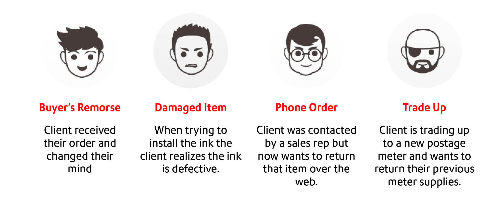
I started to create returns-specific personas and user journeys for why clients returned items for Pitney Bowes. Because supplies are very equipment specific, the return reasons could be narrower than in a more typical ecommerce store. Understanding this helped optimize the experience. From the call center interviews, I gathered all the reasons customers gave for returning items. I broke it down to 4 personas (see illustration below).

Journey Map
I then met with the Supply Line Client Support Supervisor again to understand the return policy. They applied some written and some unwritten rules when handling returns. Generally, two main factors applied: time (within 30 days, within 6 months, over 6 months) and condition of the returned item (opened or unopened).
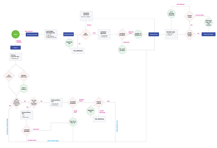
I translated all these rules into an online flow. I created a journey map to show how these would flow on the web (see illustration below).

Sketching & Wireframing
Then I created some quick hand sketches and eventually went into wire framing (see illustration below). We tested the concept with customers familiar with Pitney Bowes and then a general audience to see what might need to be clarified for new customers.
 We made several adjustments for clarity. For example, the company currently doesn’t display orders made over the phone in their online order history. So, we added a text link, “Don’t see your phone orders?” with instructions for what to do. But testers kept misreading it as a way to order by phone because they were reading quickly. We changed it to “Don’t see your order?” and it fixed the problem.
Development Scope
I met with the development team to understand the technical possibilities. This is where I hit some roadblocks. To automate the entire process became a much larger lift on the SAP (backend) team than scoped by the business analyst. This would put us behind schedule for release and far above budget. Working with the Project Manager, the Director of UX and the Manager of Web Development, we decided to release this in three phases.
Phase one would be to build the user interface to allow an online return but it would just create the returns ticket (step one in the process). The agent would still need to enter the return information into the system by hand.
Phase two would then be to keep the same user interface but change the backend process from just creating a ticket for the agent to actually entering the return information into the system and automatically generating a RMA and shipping label for the client. No Pitney Bowes agent would be involved except for when the product arrived at the warehouse. That would involve a second SAP update.
Phase three would than automate the warehouse so after the Pitney Bowes employee scans the RMA barcode, it would update the system. Also, we will introduce the ability to exchange an item instead of returning it, saving even more time and money for the client and Pitney Bowes.
All the touchpoints
Because this is a new feature, we needed it supported throughout the site. By analyzing the data, I determined that the following areas need to be addressed:
- 1. A returns instruction page needed to be created (view mockup)
- 2. Adding links in the footer for returns
- 3. Informing customers phoning the call center that returns can now be done online via automated message (IVR messaging).
- 4. When a user searches "Returns", we added quick links to returning an item.
Outcomes
As results become available and approved for release, this presentation will be updated with the impact of this project on the business.
Brand Architecture and Ecommerce
Pitney Bowes is a 100-year-old company that made its mark in the office mailing and shipping area. In the last 20 years, the company has grown to encompass technology and logistic solution for commerce. As such, the company wanted to conduct a refreshing of the brand architecture to reflect the company’s new position in the commerce space. I was hired to help build a new architecture for the pb.com website and help improve the sale of online supplies.
Goal
The goal was to make new prospects aware of our commerce technologies and services without alienating the current client base who are mostly small businesses that own a postage meter and bought supplies for their meter from Pitney Bowes. The company needed a solution that served both.
The Client
Before understanding what the business what to project to the public, we wanted to know what the public thought of Pitney Bowes. Through market research we learned people’s perception of the brand was out of date. So, it was going to take every department’s help to drive the new message to market.
I helped organize a journey mapping session with leaders from different departments. This exercise helped enforce the idea that we had to attack this together. It also brought forth the challenges and rewards of moving forward. I assigned actionable next steps with each department and did bi-weekly check-ins.
Gather Resources
My first approach was to corral the research from each product owner and understand the many users. I ended up gathering over 60 different personas that each department had independently identified. After studying all the individual resources, I was able to winnow it down to 10 genuine personas by removing or combining data points. From these 12, we were about to understand the needs of our real clients.

Brand Architecture
My next task was to reimagined the information architecture based on these 10 personas. Not only what were they looking for but how were they looking. We interviewed our existing clients as well perspective clients, getting insight into they’re true behavior. We quickly realized that the Pitney Bowes entire site structure was talking from inside out. The company was using internal jargon, product names people didn’t know, and making broad assumptions of what they thought the client knew about the company. We also identified that current website did not function well across multiple digital devices.

Old vs. New
Redoing the entire sitemap and navigation of a site is a daunting task in itself but having by-in from all department stakeholders can sometimes be even more challenging. To keep the project on target, I made sure to do the following. I brought in key stakeholders to planning meetings, limited the scope to avoid unnecessary complexity, fixed timely achievable goals, and set sufficient time for user testing and feedback.
Eventually our researched showed that clients approached looking for new products either by product or solution. For example, “I need Shipping APIs” (a product), or “I need a way to ship globally” (a solution).


