B&H Photo and Video
B&H Photo Video
B&H Photo Video is the largest non-chain photo and video equipment store in the United States which has a gross income of $3 billion a year. It's website and app is highly praised for it's great customer experience.CASE STUDY OF B&H's HELP CENTER
The UX Behind Customer Service: B&H Photo is well known for three things – its low prices, its knowledgeable staff, and its customer service. Professional photographers and video professionals see it as a must stop when visiting New York. Its knowledgeable staff is second to none. But quality seems to get lost once we go to the website (bhphotovideo.com). The goal of this project was to provide a better customer service experience and have access to the same knowledgeable staff. New B&H Help Center
About 2 years ago, there was a major redesign of the website – updating the look as well as the user experience. Because of the vastness of that project, the focus was narrowed to just the sales funnel. Areas like the Help Center was decided to be updated later. Also getting product advice, unlike in the store, was not easy way on the web. You had to call our 800 number to get customer service, who then would transfer you to Sales, who then would transfer you the proper expert. It was cumbersome and not highly visible.
 Proposed Solution
Update the design of the Help Center for a better experience and make it easier to get access to our experts.
My Design ProcessFor this project we used mostly Waterfall with some sprints of Lean UX. All aspects were supported by user research, analytics, competitive analysis, user testing, and other methods.
The tools used were Adobe Creative Suite, Sketch, Zeplin, Invision, Usertesting.com, Evernote, Fullstory.com, Google Analytics, and Jira.
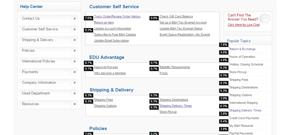
DataI wanted to start with just how often people were using our Help Center. The numbers were very low. And they didn’t stay long. I got the numbers break down on what was being clicked and surprisingly some of the lowest clicked links like Education Section (0.2%) was near the top and things like Contact Us was hidden under a collapsible menu. This gave me my first clue of some of the issues.
 Interviews
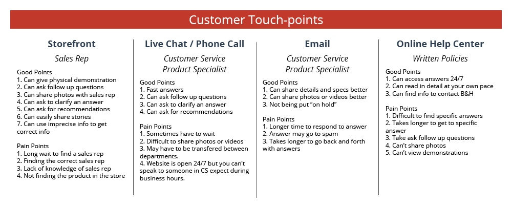
Next, I wanted to hear directly from the people who interacted with B&H customers on a daily basis. The first stop was Customer Service. There is over a hundred people answering phone calls and live chats in a given day. I set up a meeting with the Director of Customer Service to find out about the most asked topics. I also wanted to understand how each customer was treated over the phone and by live chat. So, I sat in on actually phone calls coming into the helpline. I saw how each customer was treated and listened too very closely. And especially how anger customers were handled, quickly helping them to calm down so they could be helped. It showed me the mindset of some of the customer that may be using the online help center.
The next thing I did was get a digital copy of over 500 live chats. I read through them over several days, marking every time I saw a new type of question. It turned out to be about 125 questions total (which later would by the bases of the new FAQ section, to be discuss later).
Then I wanted to speak to the actually customers. So we reached out to about 30 customers via email who had a positive or negative experience. We got about 10 people respond. I learned there was always a back story to every return or question that just isn't reflected in a live chat. It help expand my understanding.
 Persona
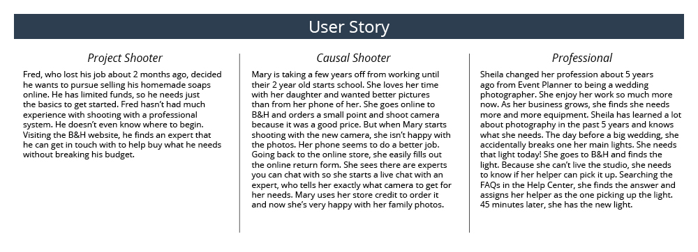
The next step was to interview sales and see how they interacted with people coming into the store. It was a very different interaction than over the phone. Because the sales staff dealt with over 10,000 people coming into the store each day, they had a very good idea what most people were looking for. In their heads, they had built their own persona of the average users. Most people were either shopping based on a particular project (sell items on Ebay), professional needs (I need a second camera that can do...), or higher-end causal shooting (I want better pictures of my family). Even though each person’s situation is unique, it helps the Sales member to better target their advice. For example, giving too much technical lingo to a causal shooter would be confusing. And the opposite is true, if they didn’t talk in the proper jargon with the professional, the customer may question the knownledge of the sales associate. I kept this in mind when building the new Help Center.
User and Job StoriesI formed user and job stories based on the three main persona I learned to explore different contexts in which a user would use the Help Center and to understand their motivation and desired outcome.
 Competitive Analysis
Next I wanted to see how other companies were treating their online Help Center. I wanted to highlight what worked very well and avoid their pitfalls for my new design. We compared B&H to similar electronic stores (like Best Buy). But we also compared ourselves to less related competitors (like Verizon) to get a broader scope. From this I was able to evaluate what was missing from our old help center. But we wanted to expand on what we found out their as well. We were known for great customer service and it needed to transfer to the web.
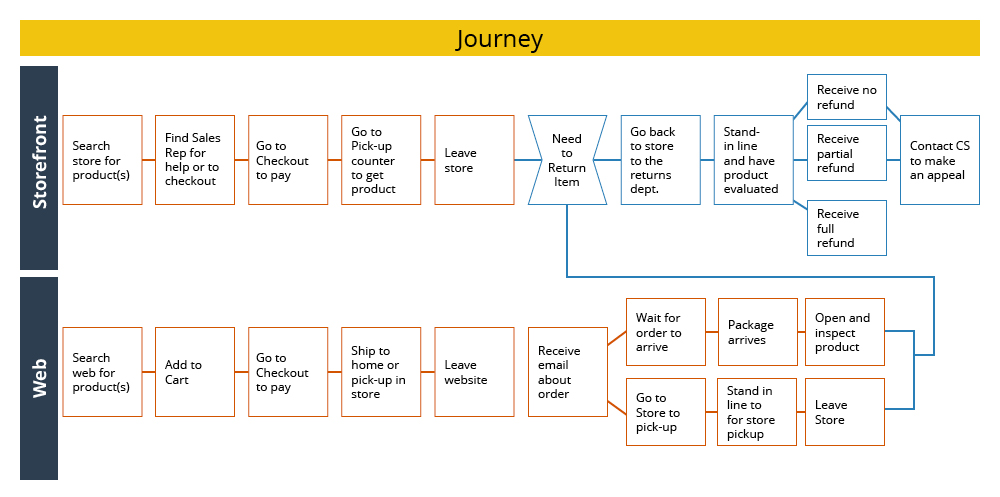
UX Game PlanBased on the job stories and my understanding of the core desires of the users, I developed a few scenarios with a series of tasks: Returning an item, Finding out about international shipping, Getting Expert Advice, and Getting an Order Status Update.
I first decided to have users go to the old Help Center (using usertesting.com) and preform these job tasks. I watched where they navigated to and noted their reactions. We asked them if they ever returned something online and had a bad or good experience. I figured that a bad experience would be memorable and a good experience would be forgotten. I found that assumption to be correct. Users were more than glad to talk about how badly a certain company messed up their return.
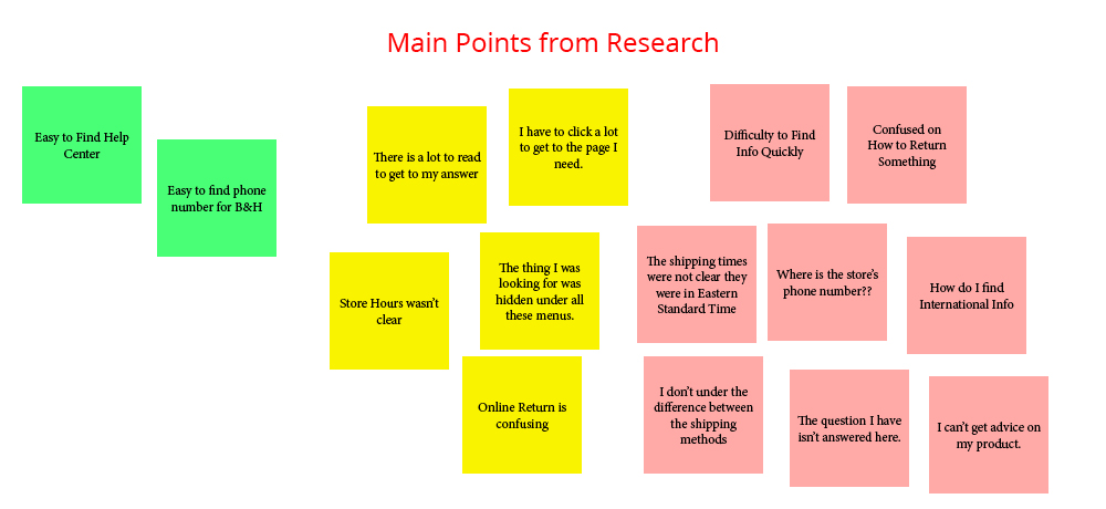
I identified the pain points and combined that with all my other research and used affinity mapping to group the main points into similar categories.
 Defining and Solving Problems
New B&H Help Center Upon all this knowledge, insights, and research, I built wireframes and prototypes. The stakeholders were involved throughout the entire process so everyone felt invested in the project. Also, the Help Center touched every department at B&H, so their input was essential. The prototypes were tested several times along the way. Sometimes for placement of items or even just word choices. We looked to solve all the big and little problems along the way. Here are the main pain points we looked out for:
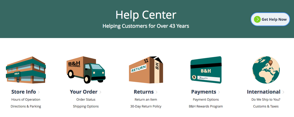
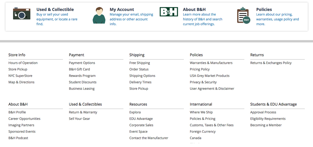
Discoverability: I wanted to expose all the options, but at the same time not overwhelm the user with to many choices. So, I developed a multi-tier hierarchy. The top 5 most requested things lived large with icons (I designed in Adobe Illustrator) on top. Then the lesser options lived on bottom with smaller icons. And then finally everything was exposed in a footer like design with just text links.
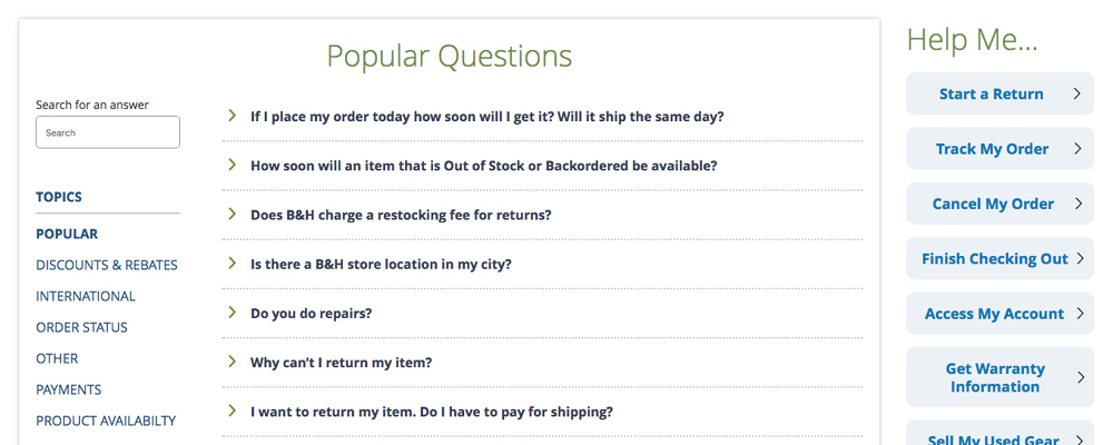
Quicker Answers: The 500 live chats and interviews with customer service gave me the info I needed to develop the 125 questions in the FAQ section (new to the Help Center). Customer Service than answered all the questions. We also added a HELP ME section, which is quick links to most requested activities (new to the Help Center as well.)
Shorter and More Relevant Text: Users didn’t want to read long copy to get one answer, so ALL the copy was rewritten to make it simpler and easier to digest in small bits. For more complex text, like the privacy policy, we broke it up and added headline to make it more scannable.
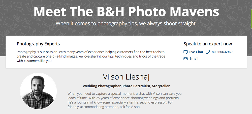
Getting Expert Advice: An entirely new section was added to the website, The Expert’s Page. It features experts of every department for product advice. It’s been a huge success for B&H. We’ve even had companies of products we sell call us to ask us questions about how their own products work with other systems. See One of the Expert’s Page
 Follow Up After Launch
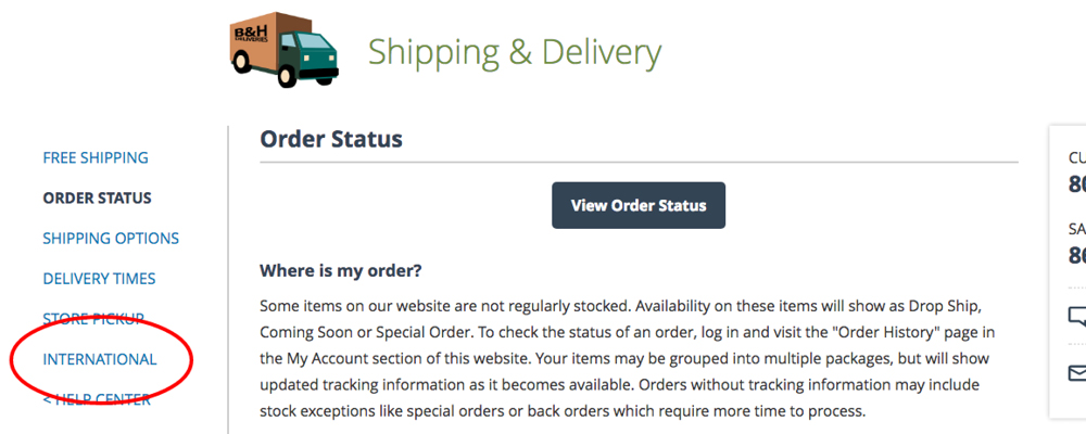
It was important to follow up after the launch to see what was working well and what was still confusing to users. We watched Fullstory.com to see how customers were navigating, and we read feedback left by customers. One example we found was that international customers were getting lost. Even though we organized everything international customers would need neatly under one tab, they were navigating to the other sections looking for their info. For example, an international customer wanting to know about Shipping was going to the Shipping section instead of the international section. So we added an International link in every section that leads them to the proper section inside the International section.
 Takeaways
Customer Service and Expert Advice is what makes B&H succeed in a market dominated by other national retailers. B&H competes for those wanting more knowledge and the ability to get answers to their questions. The old Help Center did not reflect this. The newly updated Help Center and Expert’s Page better implements this philosophy. Even small changes like exposing everything in a Help Center Footer made a huge impact.
Unlike other pages, we want users to get their answers and leave the Help Center as quickly as possible. Watching Fullstory.com, we saw that users found their answers much quicker and got back to shopping. Anytime we saw a number of user getting lost, we updated the experience to make it easier to find.
Phase 2 is being worked on now. That includes Help Center videos and more personalized info.
Other Work at B&H
Success of Store Pickup Project
One of my first projects was increasing awareness of Store Pickup. I decided to incorporate it with the Free Shipping section of the website. Because of my suggestions, Store Pickup increased 300% for B&H. Read Spec Document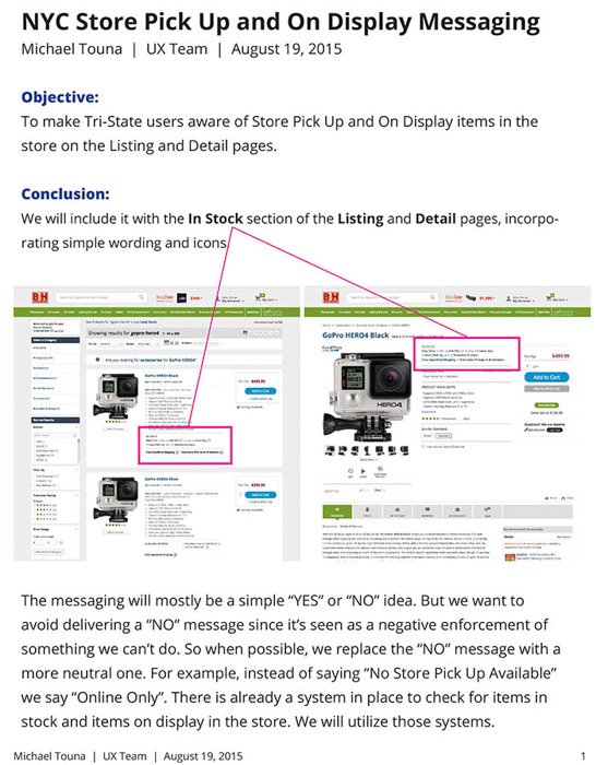
Annotated Comps
When I made a new interaction for the website, I created detailed reports describing all the points.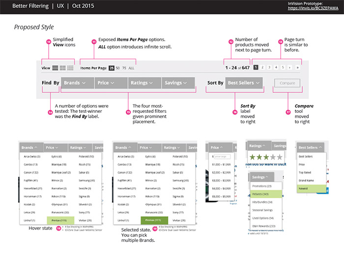
New Sections of the Website
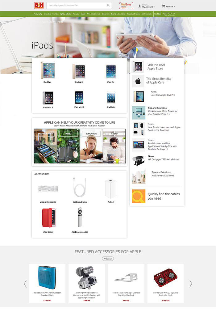
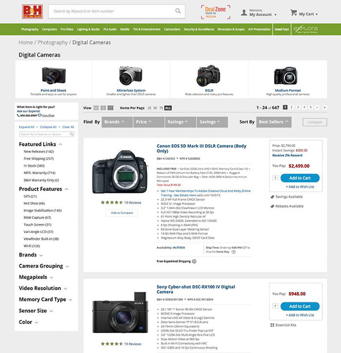
I was tasked with creating a new category page for B&H.
Promotions
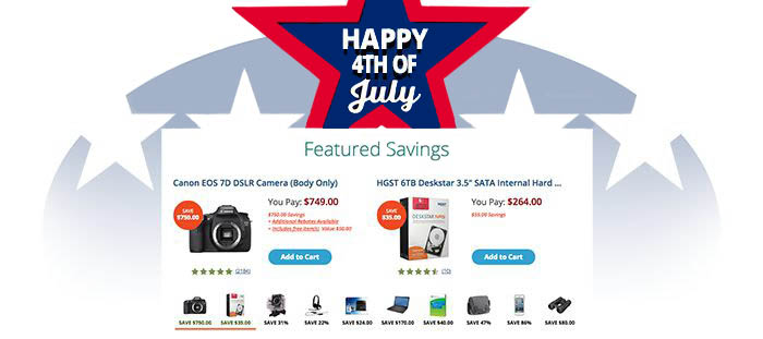
My artistic ability was utilized as well to help promote events.
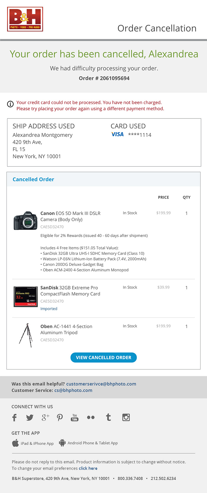
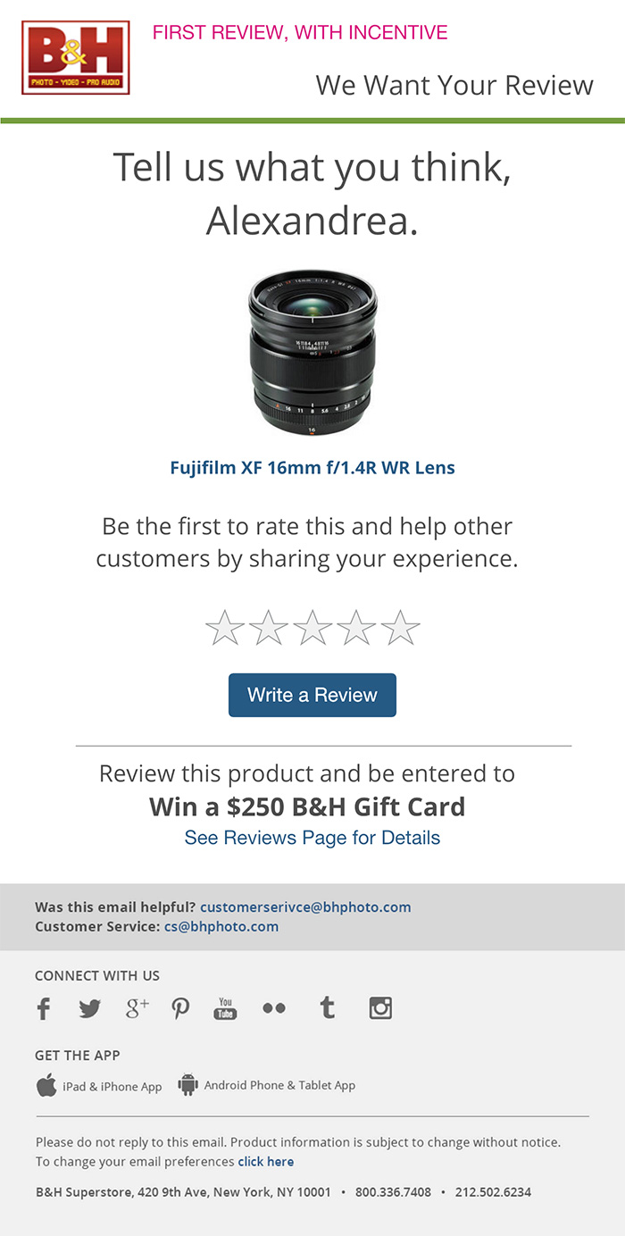
Standardizing Emails
Over the years, new emails had been created without a consistent design or message. The user was experiencing a different message each time. My task was to unify all of them.
Long-term Projects
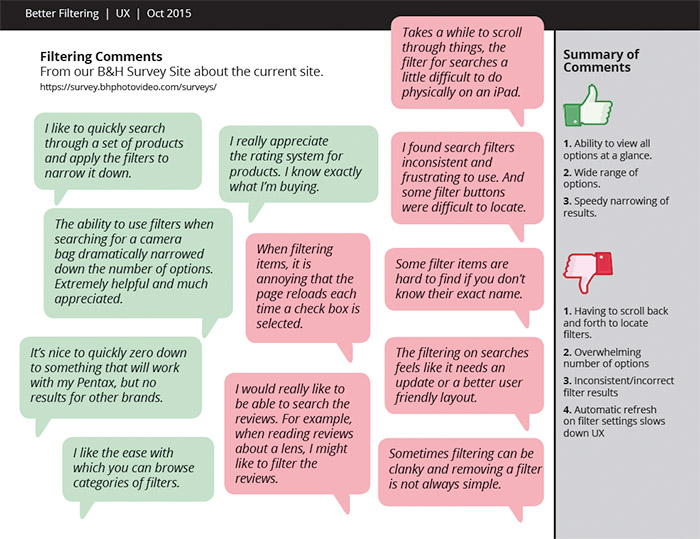
My largest project was redesigning the way user filter for projects on the site. This involved a lot of user interviews and testing.
Design Skills
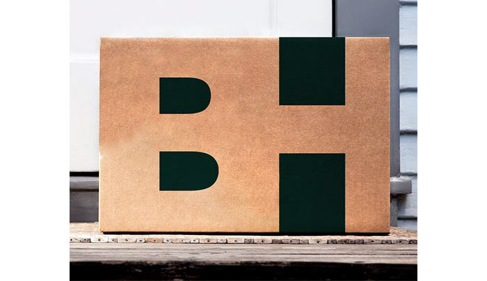
My artistic and design background was utilized to redesign the B&H logo and the B&H packaging.

Other Projects
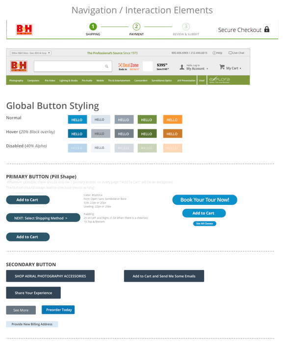
Uniformed Style Guide
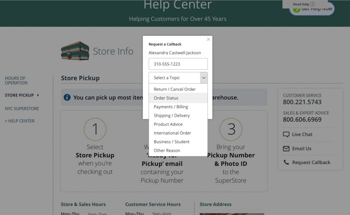
Request A Callback
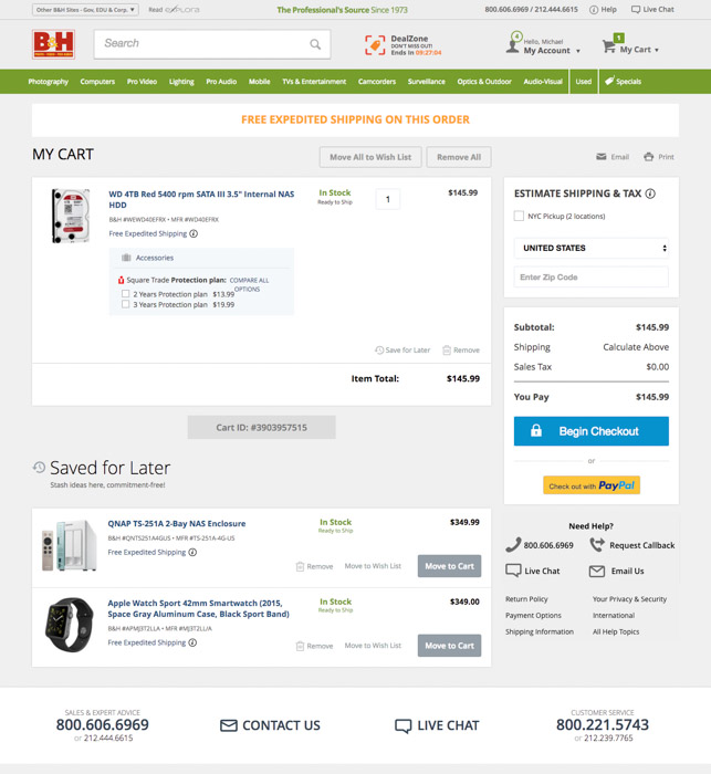
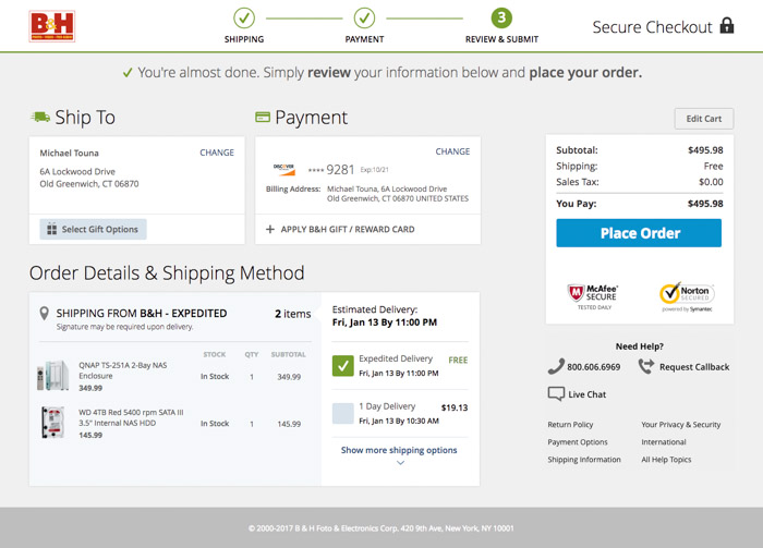
Cart Design
Checkout Design
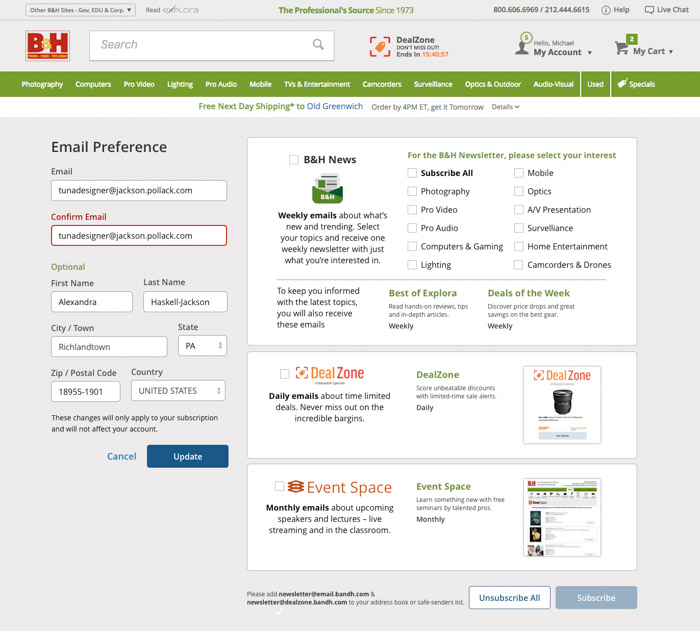
Email Preference
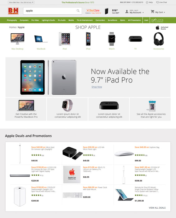
Apple Promotion